Why Most UX/UI Systems Fail at Scale (and How to Build One That Doesn’t)
Most digital products are designed to launch, not to scale. The interface looks refined in a prototype, performs well in early-stage user testing, and then gradually breaks as feature complexity and team size increase. This is not a design execution issue. It is a structural failure.
A UX/UI system is not a collection of screens or a color palette. It is a framework that connects user needs to business logic. When that framework is weak, every downstream function begins to fragment. Engineering loses efficiency, product loses coherence, and the user loses the ability to navigate with confidence.
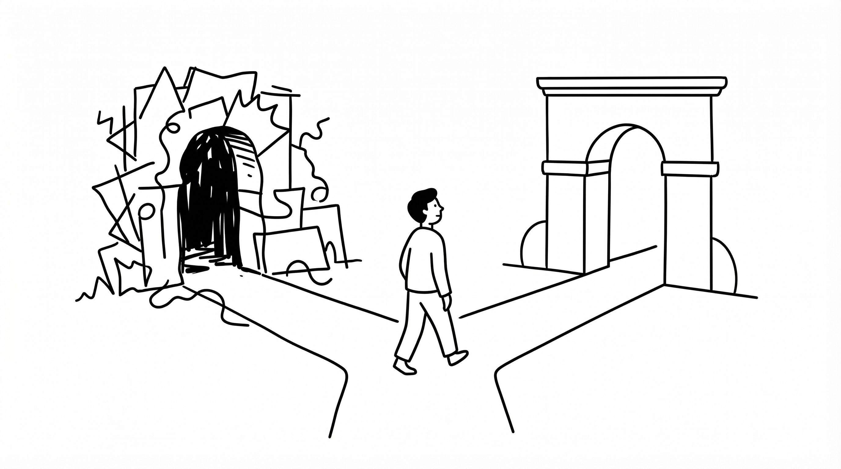
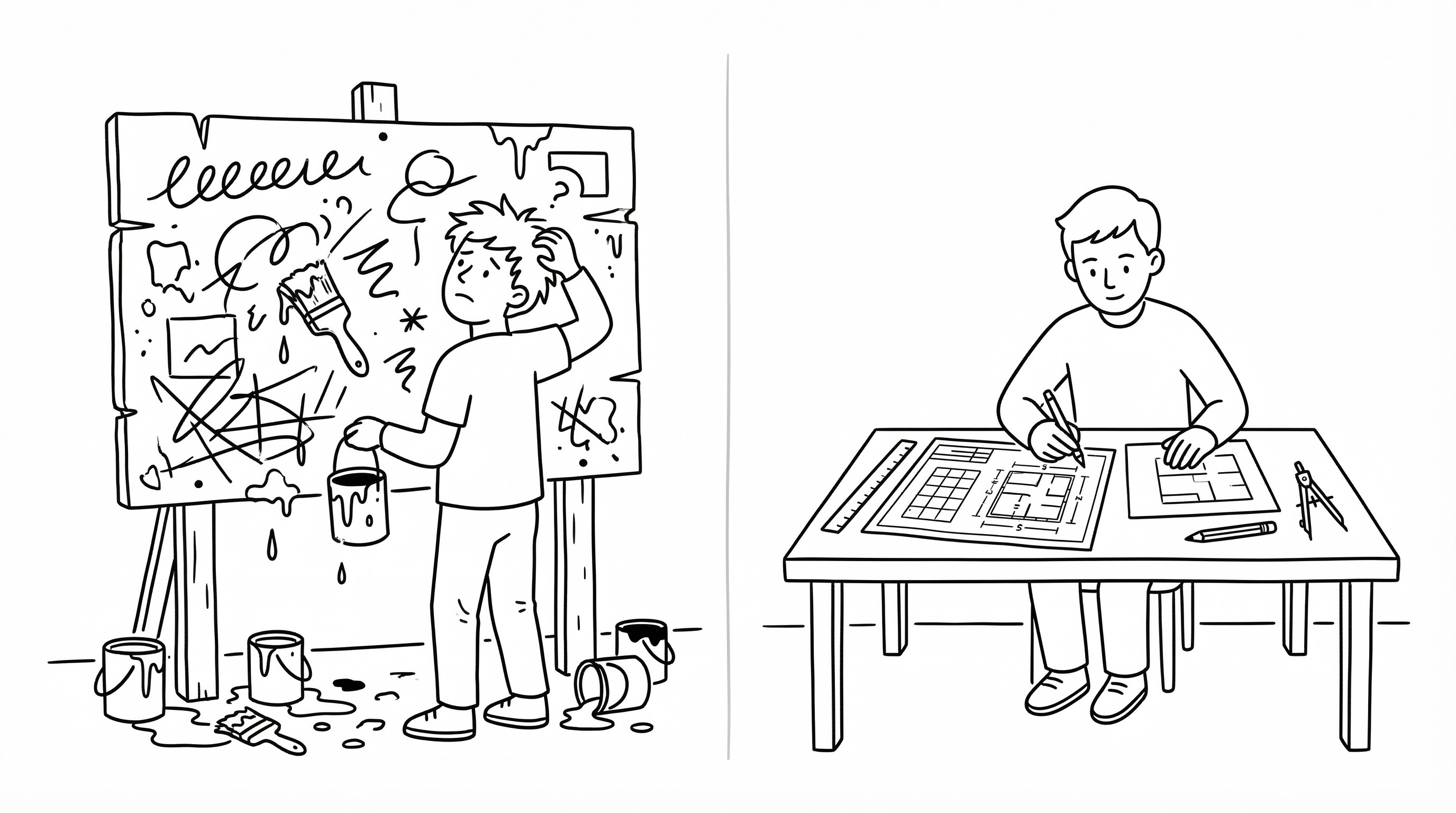
The root problem starts with how most interfaces are created. The focus is placed on aesthetics rather than interaction logic. Teams optimize for how the UI looks in a static mockup, not how it behaves across different states, edge cases, and user flows. This creates a rigid interface in a dynamic environment. As the company grows, the design lacks the logic required to adapt.
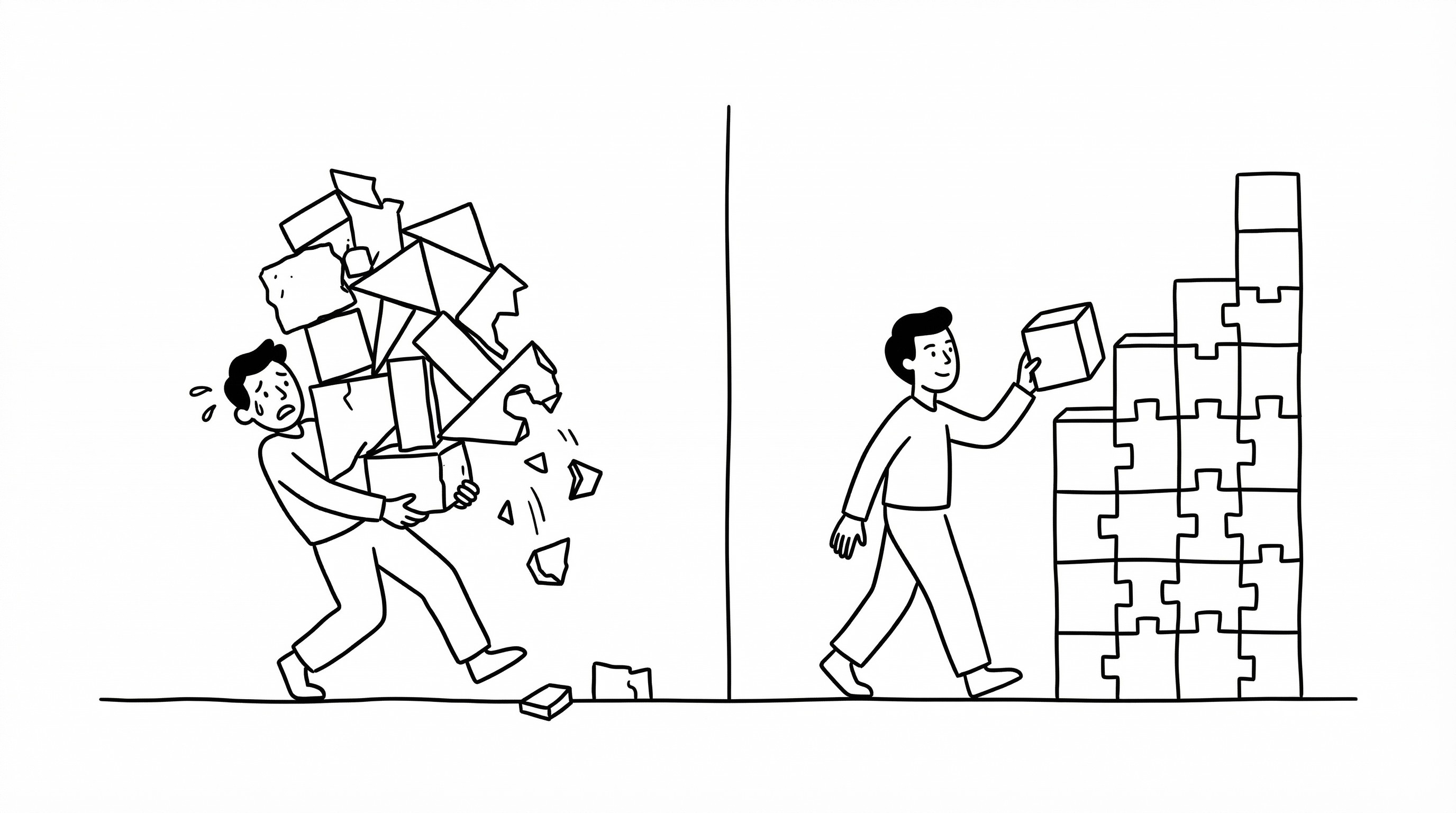
The first failure point is the absence of a living design system. A scalable UX/UI architecture is governed by rules, not just reusable components. These rules define spacing scales, interaction states, navigation patterns, and data visualization logic. Without this, every new feature becomes inconsistent. Over time, the product fragments into a collection of disjointed parts.
The second issue is misalignment between user goals and interface structure. Many teams define a strong product strategy but fail to translate it into a coherent information architecture. The result is a generic interface that blends into the market. Internally, the team believes the product is differentiated. Externally, users struggle to find value quickly. This weakens retention and increases churn.
Another structural weakness is limited scalability across platforms and devices. Early-stage products are often designed for a narrow set of viewports, usually desktop web or mobile apps. As the business grows, new surfaces emerge such as tablets, wearables, dashboards, and embedded tools. A non-systemic UI fails under this expansion. What worked in isolation breaks in combination.
There is also an operational constraint. A design system must be usable by engineers and product managers beyond the design team. If it is too complex, abstract, or poorly documented, it creates dependency. Teams either misuse the components or bypass the system entirely. Both outcomes reduce consistency. A strong system balances precision with usability, enabling execution without constant oversight.
To build a scalable UX/UI system, the approach must shift from screens to systems. A strong interface behaves like infrastructure. It is modular, responsive, and governed by clear principles. Instead of defining every possible screen, it defines the logic that produces consistent, user-centered outcomes.
The foundation is strategic clarity. User flows must be mapped and validated before visual design begins. Every interface decision should reinforce ease of use and task completion. Typography, color, spacing, and motion are not just aesthetic choices. They are functional signals that guide user behavior.
The next layer is interaction logic. This includes rules for micro-interactions, loading states, error handling, and transitions. These rules should be simple enough for engineers to implement consistently but robust enough to handle edge cases. Most user interactions follow repeatable patterns. Optimizing these patterns creates disproportionate impact on usability.
Scalability across mediums is critical. The UI must perform across different devices, network conditions, and accessibility requirements. This requires testing in multiple contexts from the start. The goal is not pixel-perfect precision in one use case, but reliable usability across many.
Documentation and governance ensure long-term consistency. Clear component libraries, contribution models, and practical usage examples are essential. However, documentation alone is not sufficient. There must be a system of control that maintains quality as the product evolves.
Incentives inside organizations also influence design consistency. Different teams optimize for different outcomes, such as shipping speed versus polish. If the design system does not integrate with these workflows, it will be ignored. A well-designed system reduces friction and supports execution without sacrificing quality.
Constraint is one of the highest leverage elements in interface design. Unlimited flexibility leads to inconsistency and cognitive load. Clear boundaries create familiarity and efficiency. The goal is not to allow infinite variation, but to control expression within a defined system.
There are common misconceptions. A full redesign is often seen as a solution to structural issues. In most cases, it is not. Without a strong system, a new visual layer will fail in the same way. Another misconception is that systemization limits creativity. In reality, constraints create better, more accessible user experiences.
A high-level approach treats UX/UI architecture as a long-term asset. The objective is sustained clarity and adaptability, not short-term visual trends. This requires investment in thinking, user research, and foundational logic, not just execution.
Average approaches prioritize speed and trends. They focus on surface-level differentiation. This may create initial attention but fails over time as technical debt accumulates. The cost appears later in the form of inconsistency, engineering inefficiency, and poor user retention.
A scalable UX/UI system is built on interaction logic, platform alignment, and governance. Each element reinforces the other. Weakness in one area compromises the entire product experience.
Scaling a product is not about maintaining a static set of screens. It is about maintaining a consistent, reliable user experience in a changing environment. Products that succeed understand this from the beginning. They design systems, not just interfaces.