The Designer's Blind Spot: Why Internal Clarity Fails User Perception
Designers operate with context. They understand the product, the user flows, the design rationale, and the reasoning behind every interaction. This depth of knowledge creates clarity internally.
The user does not have this context.
This creates a fundamental gap between how the product is perceived internally and how it is perceived externally. Designers assume that what is obvious to them is also obvious to users. In reality, users interpret the interface based only on what is visible.
This gap is one of the most common and most overlooked constraints in product performance.
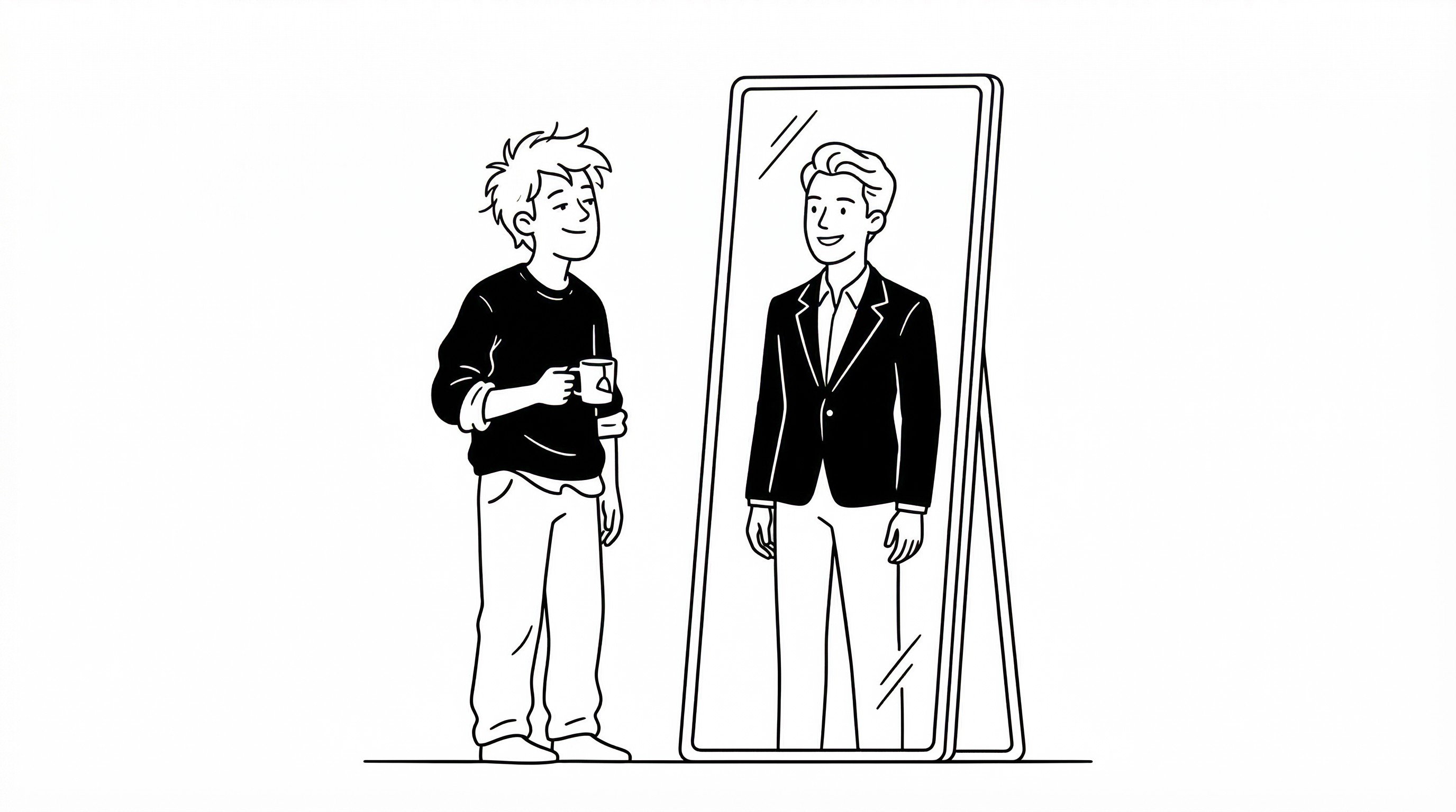
Internally, the product feels coherent. Every design decision is connected to a larger vision. Externally, the same interface may appear fragmented or confusing. Users do not see the reasoning. They only see the output.
This leads to misalignment. The product communicates one thing internally and another externally. The result is confusion.
A key factor in this dynamic is information asymmetry. Designers have access to all internal knowledge, including user research, edge cases, and flow logic. Users have access only to what appears on their screen. These signals include layout, copy, visual hierarchy, and interaction feedback.
If these signals are not clear, users fill the gaps with assumptions. These assumptions are often incorrect.
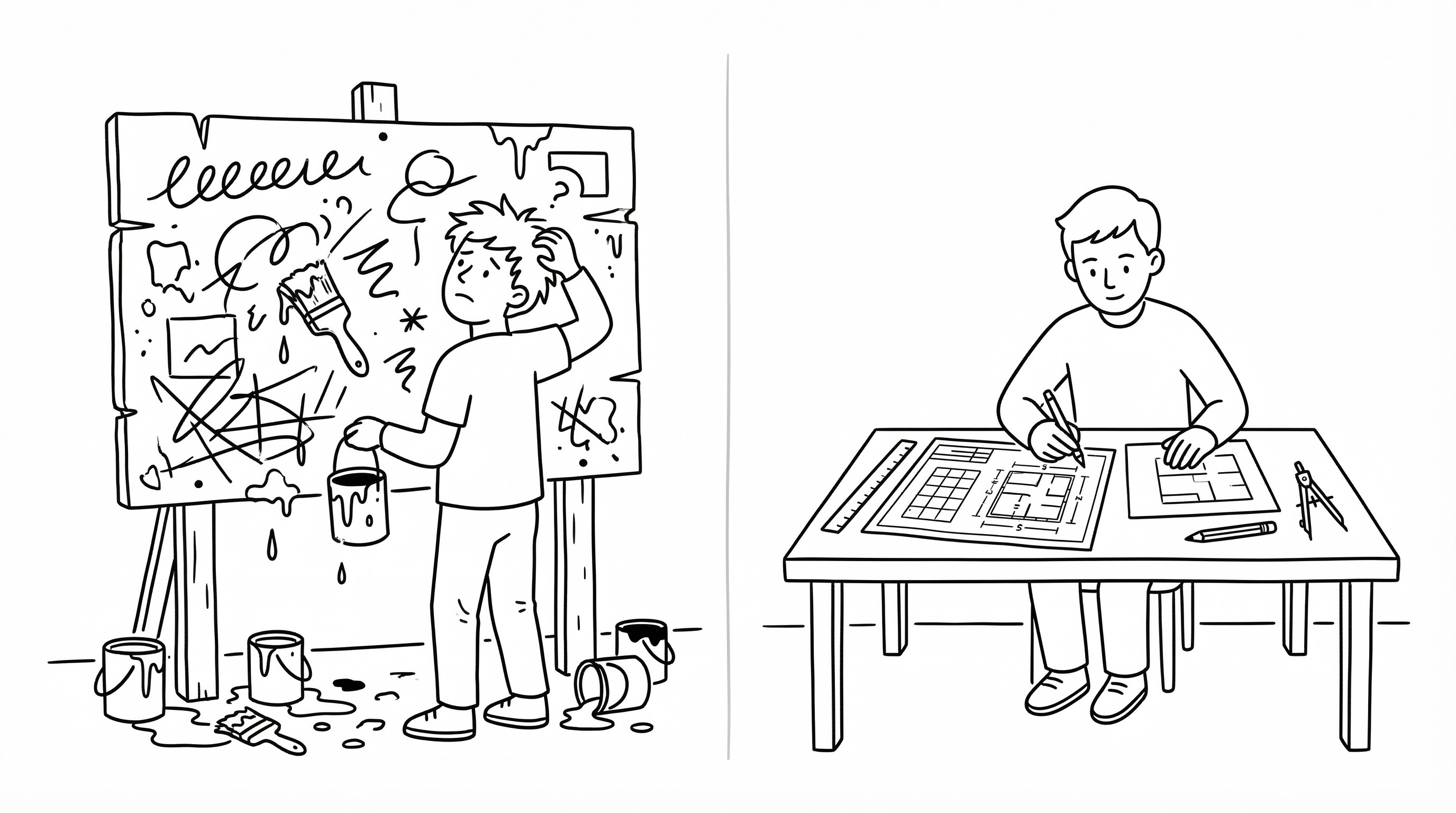
Another factor is bias. Designers are close to the product. They are emotionally and intellectually invested in the work. This proximity reduces objectivity. It becomes difficult to evaluate the interface from a fresh user perspective.
This bias affects decision-making. Designers may prioritize features or interactions that make sense internally but do not align with how users actually behave.
There is also a tendency to overestimate clarity. Because designers understand the system, they assume it is easy to navigate. This leads to under-communication, hidden affordances, or overly complex interaction patterns.
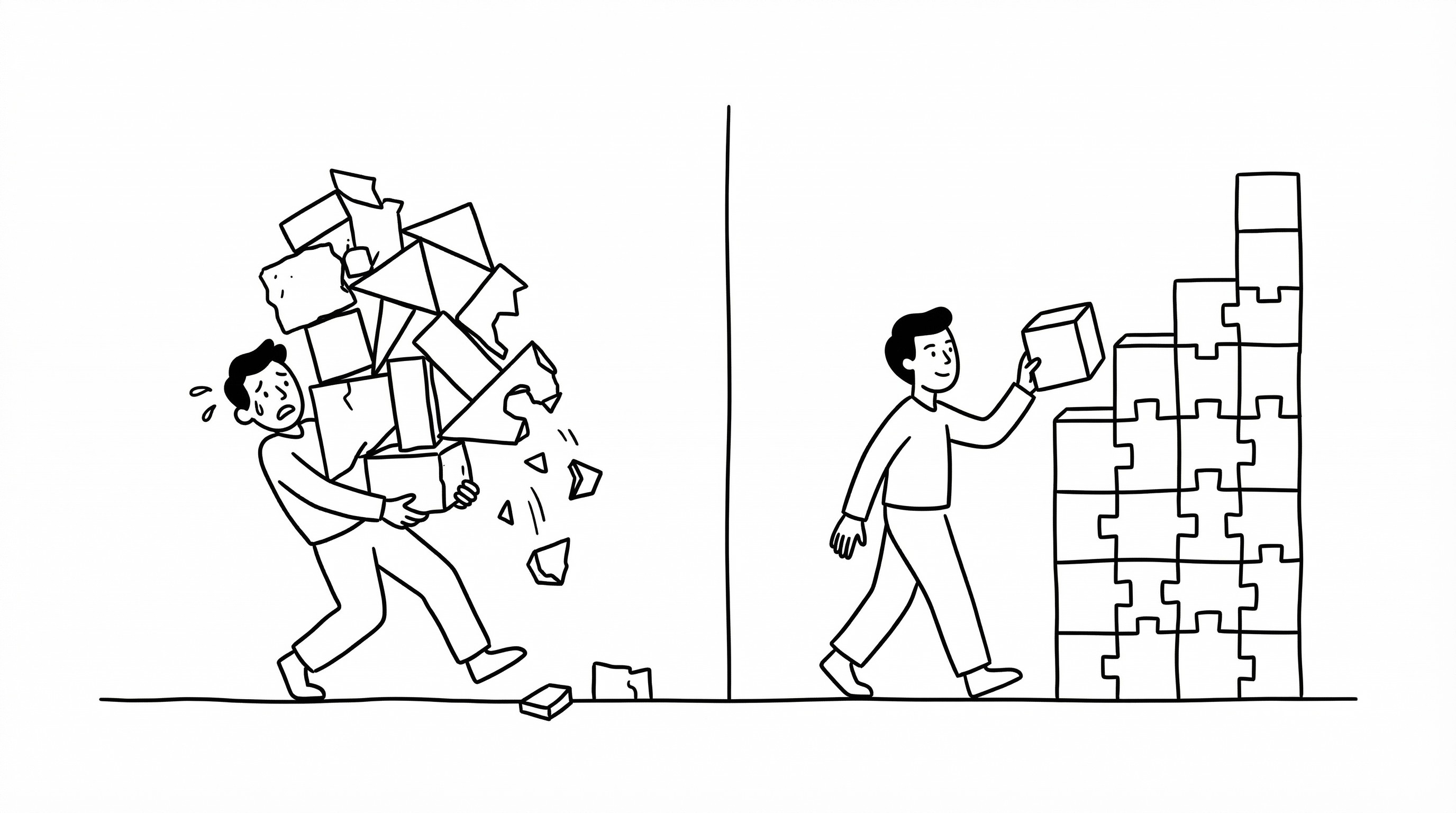
From a UX/UI perspective, this often results in clutter. Teams try to communicate every possible feature at once. Instead of creating clarity, this creates cognitive overload.
Users do not process information the same way designers do. They scan, filter, and decide within seconds. If the interface does not communicate value and intent within that window, it loses the user.
Another issue is inconsistency. Different parts of the product may function or look different without a clear reason. Without a unified design system, this leads to mixed signals and increased learning curves.
Over time, these inconsistencies compound. The product becomes harder to understand and harder to trust.
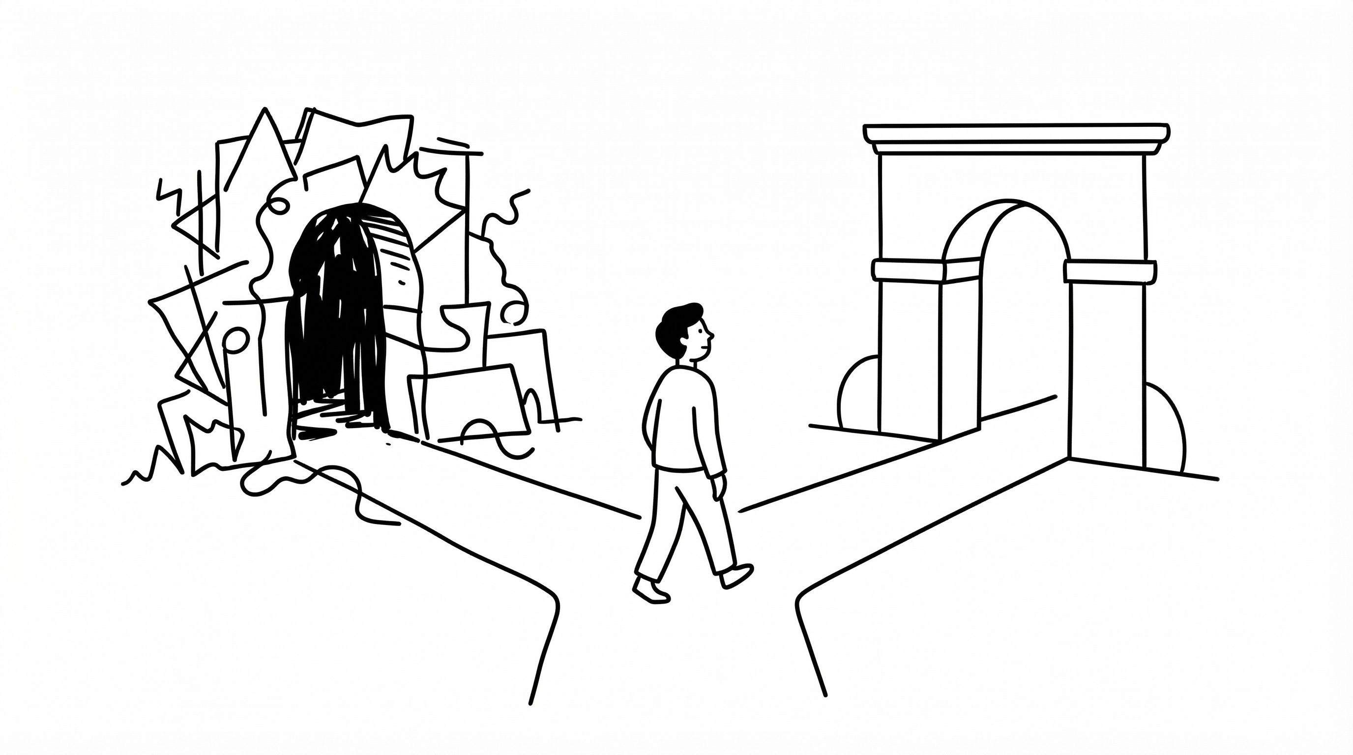
To address this, the first step is recognizing the gap. Internal clarity does not guarantee user clarity. The product must be evaluated from the user's perspective.
This requires distance. Designers need mechanisms to step outside their own perspective. This can include usability testing, unmoderated sessions, external feedback, and objective heuristic analysis.
The second step is simplification. Reducing cognitive load improves clarity. The goal is not to communicate every feature. It is to help users accomplish their core task with the least friction.
The third step is alignment. Information architecture, visual design, micro-interactions, and content must reinforce the same mental model. This creates a clear signal that users can understand quickly.
Another important factor is iteration. Perception is not fixed. It evolves based on every interaction. Testing and refining the interface over time improves alignment between intention and user understanding.
There are also structural solutions. A strong design system reduces interpretation. It provides clear rules and patterns that guide execution across teams and features. This minimizes the risk of inconsistent user experiences.
From a strategic perspective, the highest leverage point is perspective shift. Viewing the product as a first-time user, not as the designer, changes how decisions are made.
Another leverage point is feedback loops. Continuous input from users reveals gaps between design intention and actual perception.
There are risks to consider. Over-reliance on internal opinion can reinforce bias. Decisions should be informed by user data, not just internal belief.
Another risk is overcorrection. Trying to satisfy every piece of feedback can dilute the product's core value. The goal is clarity of purpose, not compromise.
Top-performing product designers understand this dynamic. They separate internal understanding from user perception. They design systems that translate one into the other effectively.
Average designers assume alignment. They believe that if the flow is clear internally, it will be clear to users. This assumption creates blind spots.
The difference becomes visible in user behavior. Clear products are easy to navigate and easy to trust. Unclear products require effort, and most users do not invest that effort.
Ultimately, UX/UI design is not about what you intend. It is about what users understand and can do.
The gap between these two defines product performance.
Closing that gap is not a creative exercise. It is a strategic one.