Design That Converts: Bridging UX/UI and Brand Identity
UX/UI design and brand identity are often treated as separate disciplines. One focuses on usability and interaction, the other on perception and emotion. In practice, they are part of the same system.
A brand creates expectations. A product's interface either confirms or breaks them.
When there is alignment, users move forward with confidence. When there is a gap, trust breaks down. This directly impacts conversion.
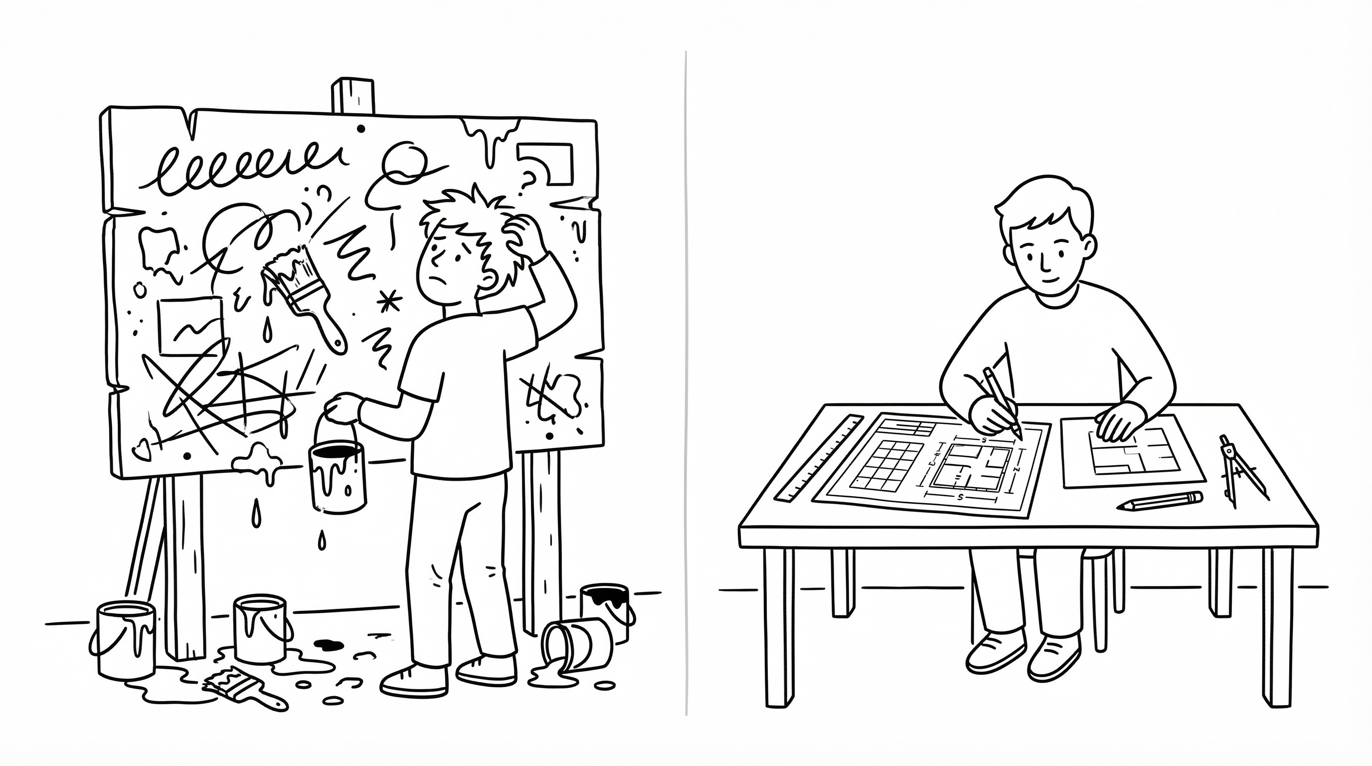
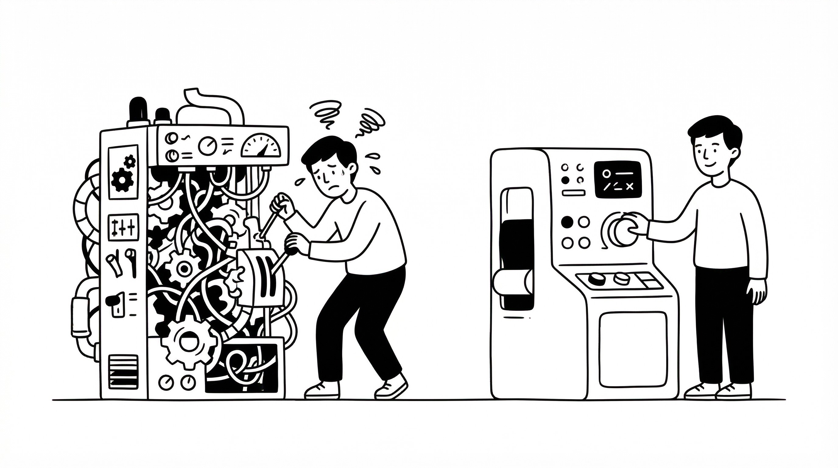
Most companies invest heavily in brand identity to attract attention. They refine visuals, messaging, and positioning. However, the UX/UI experience often evolves independently. This creates inconsistency.
Users encounter a polished brand, then interact with a confusing or poorly structured interface. The result is friction. Even if the product is functional, the mismatch reduces perceived quality.
Conversion is not only about features or pricing. It is about how easily users can move from interest to action. This process is influenced by both perception and the quality of the user interface.
The first stage is expectation setting. The brand communicates what the user should expect. This includes tone, clarity, and level of sophistication.
The second stage is interaction. The UX/UI must deliver on those expectations. If the brand signals simplicity, the interface should be intuitive. If the brand signals precision, the product should feel controlled and reliable.
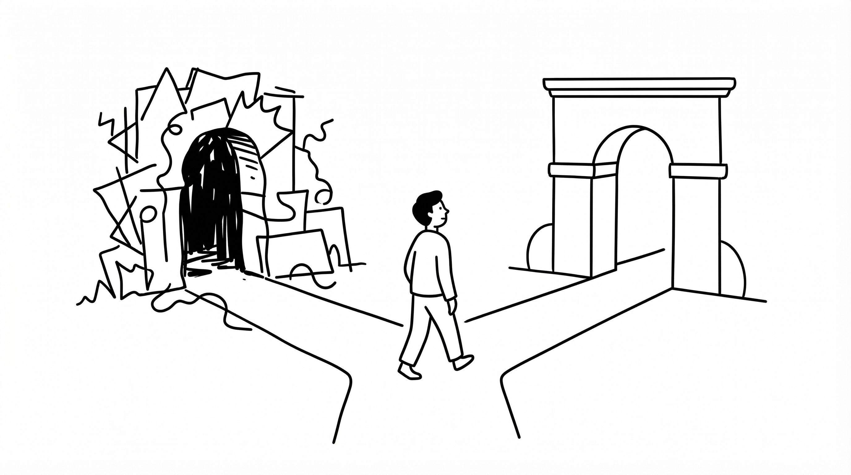
Misalignment between these stages creates cognitive dissonance. Users experience a gap between what they were promised and what they receive. This reduces trust and increases drop-off.
A key factor in alignment is consistency of logic. The same principles that define the brand should define the UX/UI system. This includes typography, spacing, hierarchy, interaction patterns, and micro-interactions.
For example, a brand that emphasizes clarity should avoid complex navigation structures and cluttered dashboards. A brand that positions itself as premium should maintain high levels of refinement in every interaction, from button states to loading animations.
Another important element is continuity. The transition from marketing to product should feel seamless. Users should not feel like they are entering a different system.
This requires coordination between teams. Marketing, UX/UI design, and product development need to operate from the same framework. Without this alignment, inconsistencies emerge.
There is also a temporal aspect. Conversion is not a single event. It is a sequence of interactions. Each step either reinforces or weakens trust.
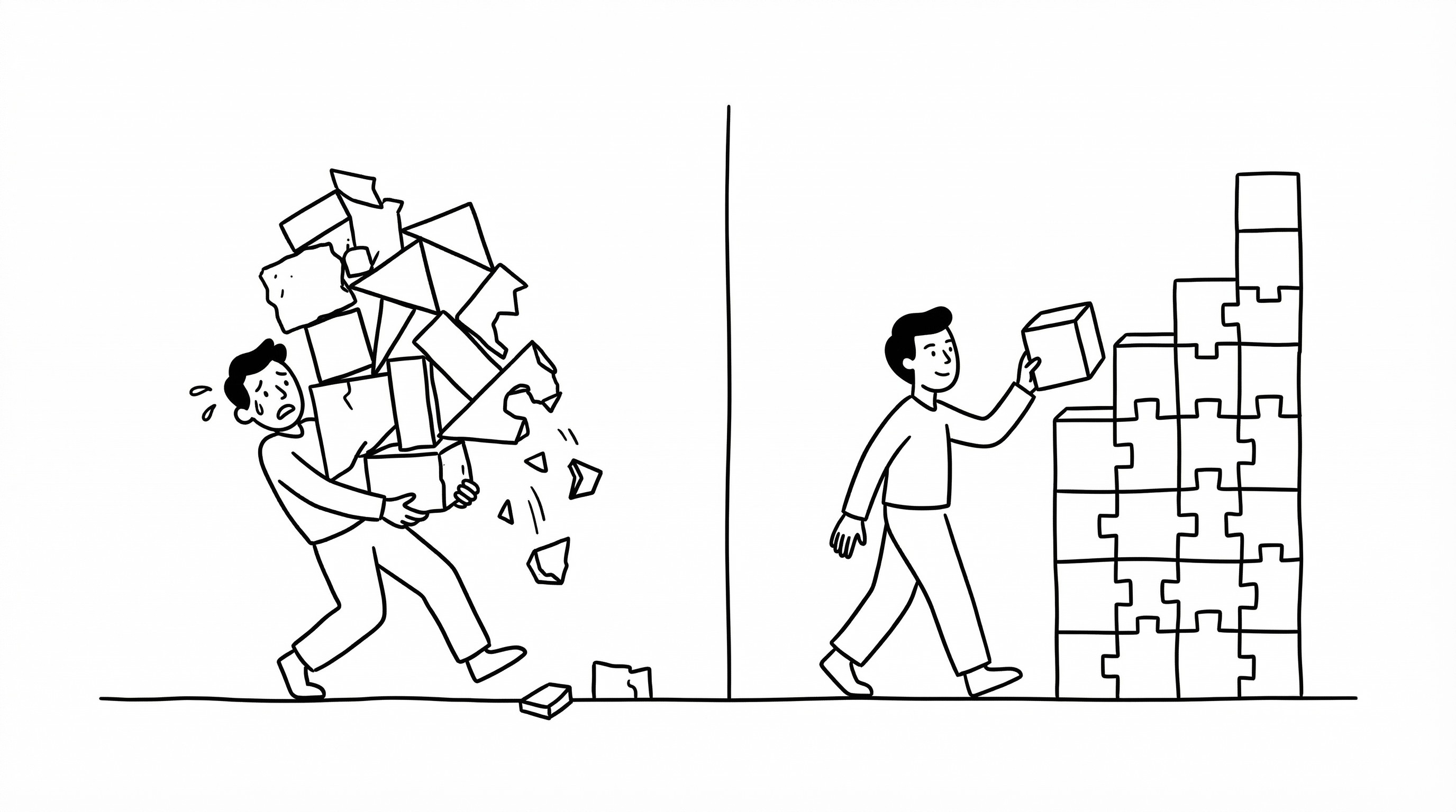
Small inconsistencies—such as mismatched button styles or inconsistent navigation—may seem insignificant in isolation. However, they accumulate. Over time, they create friction that reduces overall performance.
From a structural perspective, the solution is integration. Brand identity should not be applied after the UX/UI is built. It should be embedded into the product design process from the start.
This ensures that visual and functional decisions are aligned from the beginning, creating a cohesive experience rather than a patched-together one.
Another key factor is simplification. Removing unnecessary steps, elements, and cognitive load improves both usability and perception. Simplicity increases confidence, which supports conversion.
There are also common misconceptions. One is that improving conversion requires adding more features, CTAs, or persuasion tactics. In many cases, the opposite is true. Reducing complexity and improving usability has a greater impact.
Another misconception is that brand and UX/UI can be optimized independently. This leads to local improvements but global inconsistency. The interface may look polished, but if it doesn't function in a way that aligns with the brand promise, users will still disengage.
Top-performing companies treat brand and UX/UI as a unified system. They design experiences where every element—visual and interactive—reinforces the same message.
Average companies treat them as separate layers. They focus on optimizing individual components without considering the overall experience.
The difference becomes visible in user behavior. Aligned systems feel intuitive. Users move forward without hesitation. Misaligned systems create friction. Users pause, question, and often leave.
One of the highest leverage points is the first interaction within the product. If users immediately understand how to proceed—because the interface matches the brand's tone and clarity—they are more likely to continue.
Another leverage point is feedback. Clear responses to user actions, such as button states, confirmation messages, and error handling, increase confidence. This reinforces trust and encourages further engagement.
There are risks to consider. Overemphasis on branding can lead to reduced usability. Visual consistency should not compromise function. A beautiful interface that is hard to navigate will hurt conversion more than it helps.
Another risk is neglecting the emotional aspect. Conversion is not purely rational. Users respond to how the experience feels. Micro-interactions, motion design, and thoughtful details all contribute to the emotional response that drives action.
From a strategic perspective, the goal is alignment. Every touchpoint—from the first ad to the final checkout—should reinforce the same perception and support the same outcome.
UX/UI design is not just about how things look or how they work. It is about how they work together.
When brand identity and UX/UI are aligned, conversion becomes a natural outcome. Users trust the system, understand the process, and move forward with confidence.
That is where real growth happens.